Example GIF of the dashboard I created below.
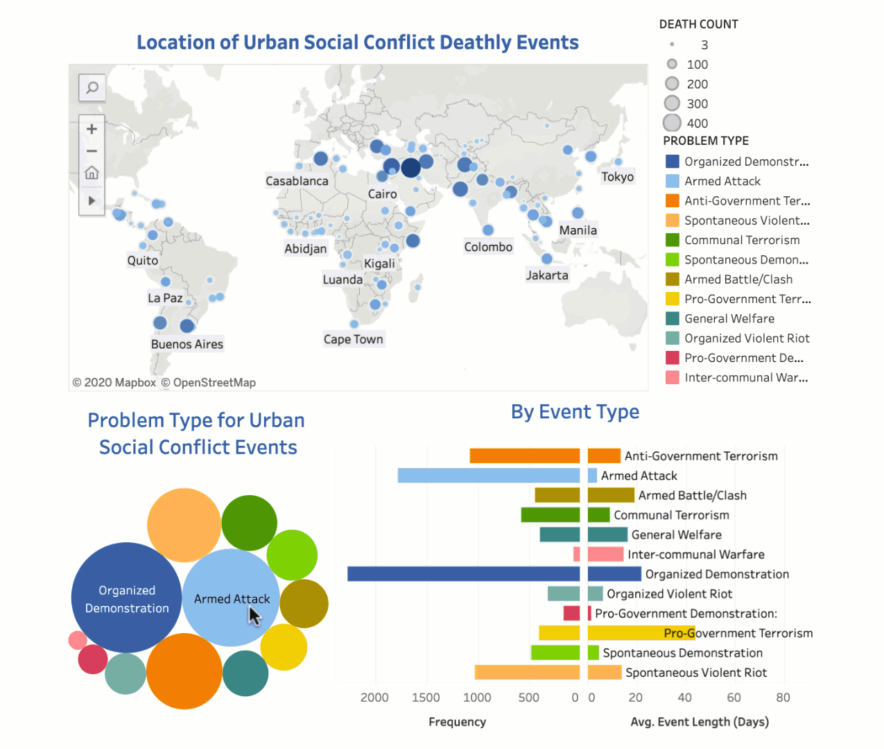
Analysis can be made from the interactive dashboard by identifying trends in total number of deaths, average length of social conflicts, and frequency of social conflicts by country.
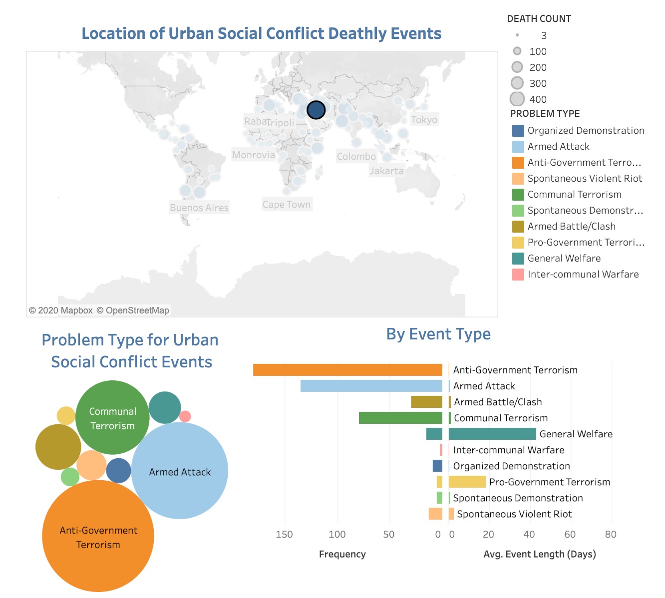
For example, you can see in Figure 1 Baghdad has the largest number of deaths. In addition, it has the highest frequency of Anti-Government Terrorism events shown in orange and the lowest frequency of Inter-communal Warfare events shown in pink. In contrast, Anti-Government Terrorism events have the shortest average event length whereas General Welfare has the longest average event length.
Figure 1
Data retrieved from Peace Research Institute Oslo (PRIO).
“The Urban Social Disorder dataset contains information on urban social disorder events occurring in capitals and other major cities of the developing world for the 1960-2014 period.”