The project’s purpose is to predict the number of COVID-19 cases in South Korea with SIR modeling.
SIR modeling takes in dynamics of the COVID-19 outbreak as parameters and that is where the acronym is derived from. Those parameters are Susceptibles, Infected, and Recovered for a given time.
Data Set
We are using time series data from the GitHub datasets repository. The data has been cleaned and normalized for public use. The data is sourced from the team at Johns Hopkins University Center for Systems Science and Engineering (CSSE) who have been maintaining and collecting data from around the world.
Relevant Links:
https://github.com/datasets/covid-19
https://github.com/CSSEGISandData/COVID-19
# Loading Libraries
library('ggplot2')
library('deSolve')
library('EpiDynamics')
library('dplyr')

# Reading Data
df <- read.csv("time-series-19-covid-combined.csv", header = TRUE, sep =",")
Exploratory Data Analysis
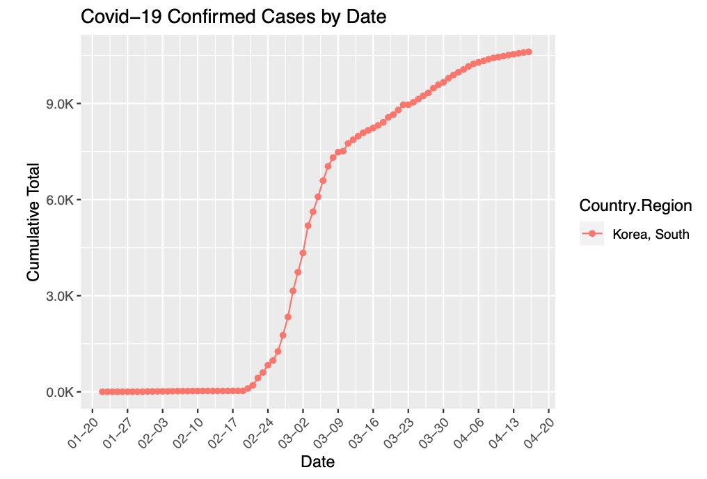
We filtered the data for only South Korea and visualize the cumulative total of cases since January 22, 2020.
# Group the data by Country and Date
covidFilterData <- df %>%
  dplyr::filter(Country.Region %in% c("Korea, South")) %>%
  group_by(Date, Country.Region) %>%
  summarise(Confirmed = sum(Confirmed), Deaths = sum(Deaths))
# visualize confirmed cases by date
ggplot(data = covidFilterData, aes(x = as.Date(covidFilterData$Date, "%Y-%m-%d"), y = Confirmed, group = Country.Region)) +
  geom_line(aes(color = Country.Region)) +
  labs(x = 'Date', y = 'Cumulative Total') +
  geom_point(aes(color=Country.Region))+
  ggtitle("Covid-19 Confirmed Cases by Date")+
  scale_y_continuous(labels=scales::number_format(scale=.001, suffix="K")) +
  scale_x_date(date_labels="%m-%d", date_breaks="1 week", limits=as.Date(c('2020-01-22', '2020-04-17'))) +
  theme(axis.text.x = element_text(angle = 45, hjust = 1))

Compiling the SIR Model
We estimated South Korea’s population and compiled the SIR model to take time, state, and parameters (estimates of the avgContacts and recoverRate) as inputs. The SIR model estimates the number of cases of Susceptibles, Infected, and Recovered for a given time. avgContacts is the average number of people contacts per person and recoverRate is the recovery rate. We calculate avgContacts and recoverRate by minimizing the Residual Sum of Squares.
# South Korea population
p <- 51178579

SK <- subset(df, Country.Region == "Korea, South")
colnames(SK)[6] <- "cases"
SK$Date <- as.Date(SK$Date)

# SIR Model
SIR <- function(time, state, parameters) {
  par <- as.list(c(state, parameters))
  with(par, {
    dS <- -avgContacts/p * I * S
    dI <- avgContacts/p * I * S - recoverRate * I
    dR <- recoverRate * I
    list(c(dS, dI, dR))
    })
}

# Number of Confirmed COVID-19 Cases
infected <- as.integer(SK$cases)
time <- 1:length(infected)
init <- c(S = p-infected[1], I = infected[1], R = 0)

# Residual Sum of Squares
library(deSolve)
RSS <- function(parameters) {
  names(parameters) <- c("avgContacts", "recoverRate")
  out <- ode(y = init, times = time, func = SIR, parms = parameters)
  fit <- out[ , 3]
  sum((infected - fit)^2)
}
Training the SIR Model
Training the SIR model by using R’s optim function to optimize the parameters and finding estimates for avgContacts and recoverRate.
# Initializing the Optimizer
opt <- optim(c(0.5, 0.5), RSS, method = "L-BFGS-B", lower = c(0, 0), upper = c(1, 1))

# Estimating avgContacts and recoverRate Parameters
opt_par <- setNames(opt$par, c("avgContacts", "recoverRate"))
Fitting the Model and Graphing Predictions
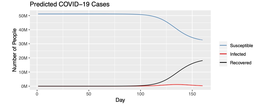
We fit the model with our current data and predict values for 160 days. From the first graph below, it is estimated that the majority of the South Korean population, around 50 million, are susceptible until the 100 days mark. The number of susceptible people begin to decline after 100 days and the number of people in recovery begin to incline after 100 days.
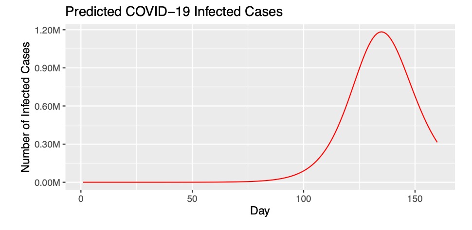
The second graph visualizes the worst case scenario of the number of infected cases. The reason it is worst case scenario is it is still early on in the epidemic and there are still many preventative measures and treatments being evaluated. The second graph predicts a peak at 140 days of almost 1.2 million people being infected.
# T is Time in Days
t <- 1:160

# Fitting the Model
fit <- data.frame(ode(y = init, times = t, func = SIR, parms = opt_par))

ggplot(data = fit, aes(x = time)) + geom_line(aes(y=S, color="steelblue"))+geom_line(aes(y=I, color="red"))+geom_line(aes(y=R, color="black")) + labs(x = 'Day', y = 'Number of People')+ ggtitle("Predicted COVID-19 Cases")+scale_y_continuous(labels=scales::number_format(scale=.000001, suffix="M")) + scale_color_identity(name="", breaks=c("steelblue", "red", "black"), labels=c("Susceptible", "Infected", "Recovered")
,guide = "legend")

ggplot(data = fit, aes(x = time))+geom_line(aes(y=I), color="red")+ labs(x = 'Day', y = 'Number of Infected Cases')+ggtitle("Predicted COVID-19 Infected Cases")+scale_y_continuous(labels=scales::number_format(scale=.000001, suffix="M"))
